
Pluralsight Leader Hub
Overview
Pluralsight, an online learning platform, caters to both “Learners” seeking tech-related courses for skill enhancement and “Leaders” utilizing data insights to understand learner engagement. The focus was on revamping the Leader Dashboard, the main interface for leaders, which currently lacks usability and is based on an outdated codebase, leading to underutilization and data accuracy issues. The project aimed to enhance the dashboard’s functionality, modernize the codebase for easier maintenance, and improve data accuracy, ultimately empowering leaders to make informed decisions within the Pluralsight ecosystem.
The Problem
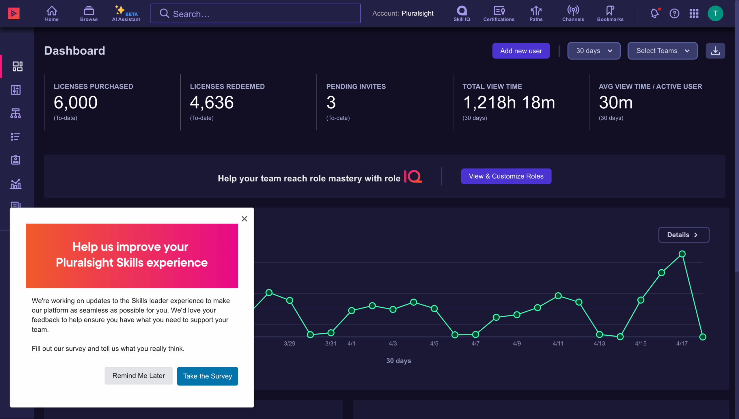
Pluralsight’s current Leader Dashboard poses critical issues stemming from confusing and unhelpful metrics, hindering informed decisions due to unclear user engagement and plan performance insights. The clutter of repeat metrics adds unnecessary complexity, while our commendable onboarding process lacks depth and personalization for an optimal user experience. These issues highlight the urgent need to refine and optimize the dashboard to deliver clear insights and improve onboarding for users and leaders. Additionally, the dashboard lacks actionability, prompting our goal to empower leaders to initiate direct actions addressing their specific needs.
Discovery
Customer Feedback
To kickstart our discovery process, we undertook several key steps. Firstly, we meticulously reviewed feedback and loss codes provided by our dedicated sales team. This allowed us to gain valuable insights into the pain points and concerns expressed by our customers during their interactions with our products or services. Additionally, we delved into past research conducted by various teams within our organization, exploring the rich tapestry of insights gleaned from customer feedback and experiences. By synthesizing this wealth of information, we aimed to uncover patterns, identify recurring themes, and ultimately inform our strategic decision-making moving forward

In-App Survey
To further enrich our understanding, we leveraged Pendo to craft a comprehensive survey aimed at our esteemed customers, focusing specifically on their experiences with our existing dashboard. Informed by the insights garnered from our initial review process, we tailored the survey questions to probe deeper into the areas of concern highlighted by our sales team feedback and past research findings. Among the pivotal inquiries posed, we sought clarity on how customers perceive and define "Value" when engaging with the Pluralsight platform. This strategic question aimed to unravel the nuanced perspectives and expectations regarding the tangible benefits derived from our offerings, guiding us towards refining and enhancing our dashboard to better meet their evolving needs and preferences.
Internal and External Interviews
In our quest for comprehensive insights, we embarked on a series of interviews with internal stakeholders, casting a wide net that encompassed various product teams, Customer Success Managers, Customer Service Representatives, and other customer-facing units. Through these engagements, we gleaned invaluable perspectives on the intricacies of customer interactions and pain points related to the dashboard and Leader experience. Building upon this foundation, we strategically reached out to key customers associated with the identified loss codes and those highlighted during internal interviews. This targeted approach allowed us to engage directly with individuals who had firsthand experience with our platform, ensuring that their feedback played a pivotal role in shaping our understanding and subsequent action plans.

Findings
Leader Personas
Within our user base, we engage with four primary leader personas: the Chief Technology Officer (CTO), Tech Lead, Chief Learning Officer (CLO), and Plan Admin. Each of these have unique jobs-to-be done, and spend their time in three key areas.
People Management – where Leaders add and remove licenses, assign permission, and create teams.
Content Curation – where Leaders can create different playlists of content called Channels and Paths.
Analytics – where Leaders can view what learners are engaging with and help guide their learners to engaged in content that is important to the company.


Leaders are wanting quick answers to the following three questions:
Answering these three questions is absolutely pivotal when it comes to proving ROI or value to our organization. By equipping our leaders with the means to substantiate this value, we not only ensure future renewals but also pave the way for potential expansions of our plans. Demonstrating the tangible benefits of our solutions not only solidifies our position within the organization but also fosters trust and confidence in our capabilities
Are my Leaners Using Pluralsight?
What are my Learners engaging with?
How are my Learners applying what they have learned?
Confusing
Metrics are confusing and unhelpful, lacking clarity on user engagement and
plan performance.
Repeats
Presence of repeat metrics adds unnecessary complexity and clutter.
No actions
Does not empower leaders to initiate actions directly from the dashboard to address their specific jobs to be done.
Solution
"An actionable dashboard, with the metrics you want when you need them."
Our solution encompassed a comprehensive overhaul of both the front end and backend aspects of the Dashboard. On the front end, we identified and prioritized six key areas for improvement, each aimed at enhancing the user experience and functionality of the platform. Simultaneously, on the backend, we developed a robust infrastructure capable of accommodating future widget implementations while empowering other teams to create and deploy widgets autonomously. This dual approach ensured not only a seamless and intuitive user interface but also laid the groundwork for scalability and innovation, enabling our platform to evolve dynamically in response to changing user needs and technological advancements.
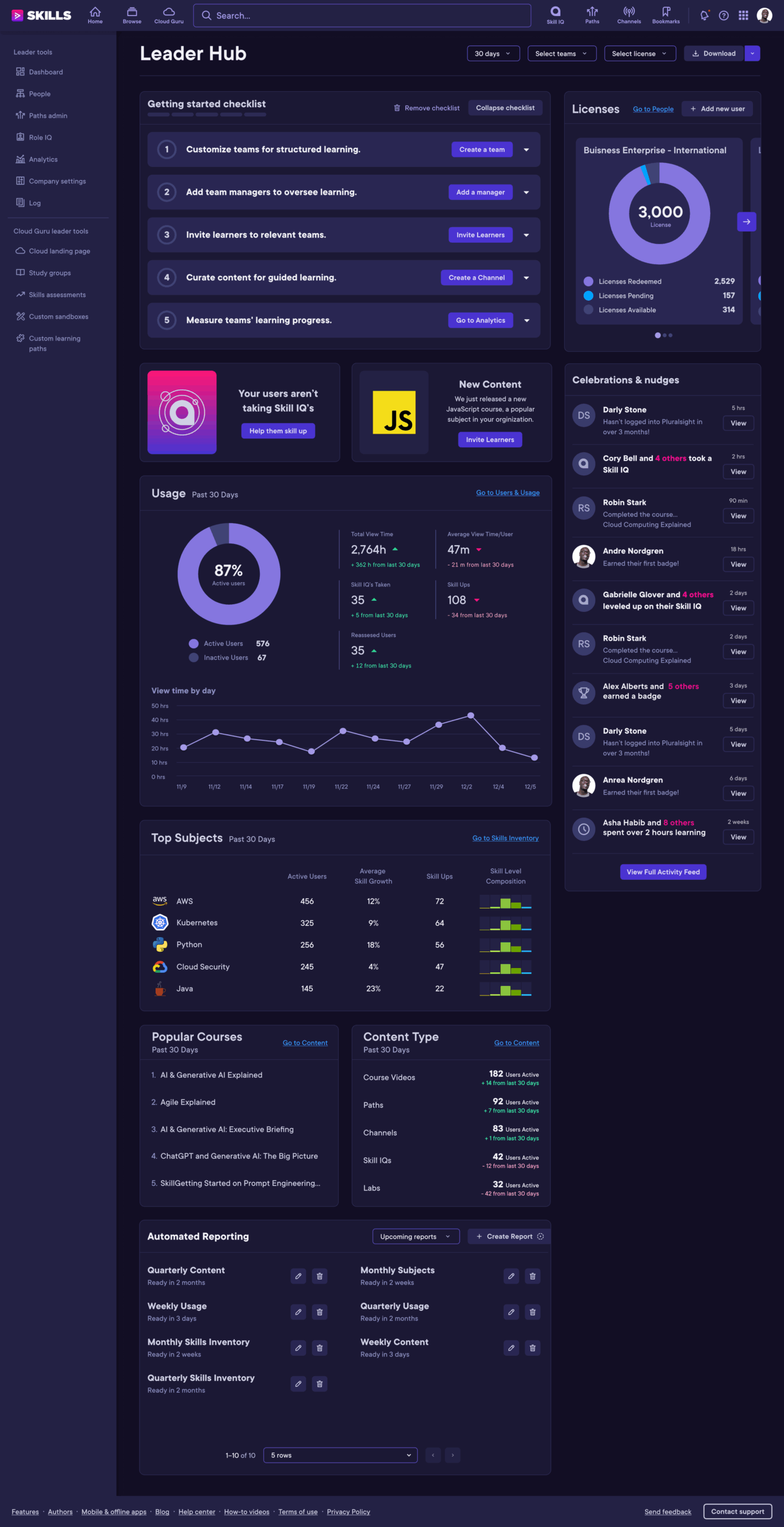
Onboarding Checklist
Our dashboard's onboarding checklist efficiently guides users through essential site areas, jumpstarting their plan with ease. From profile setup to feature exploration, each step is designed for swift acclimation, ensuring users quickly harness the platform's full potential.
Actionable Communications
Our widget highlights key problems or new features on the Pluralsight platform, offering actionable insights for leaders. By pinpointing areas for improvement or showcasing novel functionalities, it empowers leaders to take informed actions, driving optimization and innovation within the platform.
Eagle Eye Analtyics
Our Eagle Eye Analytics widgets—Usage, Top Subjects, Popular Courses, and Content Type—deliver essential insights for leaders. Usage tracks platform engagement, Top Subjects identifies sought-after topics, Popular Courses highlights in-demand learning pathways, and Content Type categorizes formats. These tools provide actionable intelligence to optimize the Pluralsight platform effectively.
Automated Reporting
Our automated reporting feature streamlines the analytics process by delivering regular reports directly to users' email inboxes. This functionality significantly reduces the time spent logging into the platform, downloading reports, and manipulating data in external BI tools. With automated delivery, users can effortlessly access the insights they need and swiftly leverage visualizations to demonstrate the value of Pluralsight within their organization.
License Metrics
We enhanced the data displayed on license metrics to provide leaders with a more comprehensive view of usage and engagement. By expanding the range of data points, leaders can now gain deeper insights into how licenses are utilized across teams and individuals. This enriched data allows leaders to make more informed decisions regarding resource allocation, training initiatives, and overall platform optimization, ultimately driving greater value and impact within their organization.
Celebrations & Nudges
Our Celebrations and Nudges feature empowers leaders to recognize and acknowledge learner achievements while fostering transparency within the organization. Leaders can easily identify noteworthy accomplishments and publicly celebrate learner milestones, promoting a culture of recognition and encouragement. Additionally, this feature serves as a proactive tool for identifying learners who may be disengaged or not accessing valuable content. By sending personalized nudges, leaders can gently encourage learners to re-engage with the platform or guide them towards relevant content, ensuring continuous learning and maximizing the platform's impact across the organization.

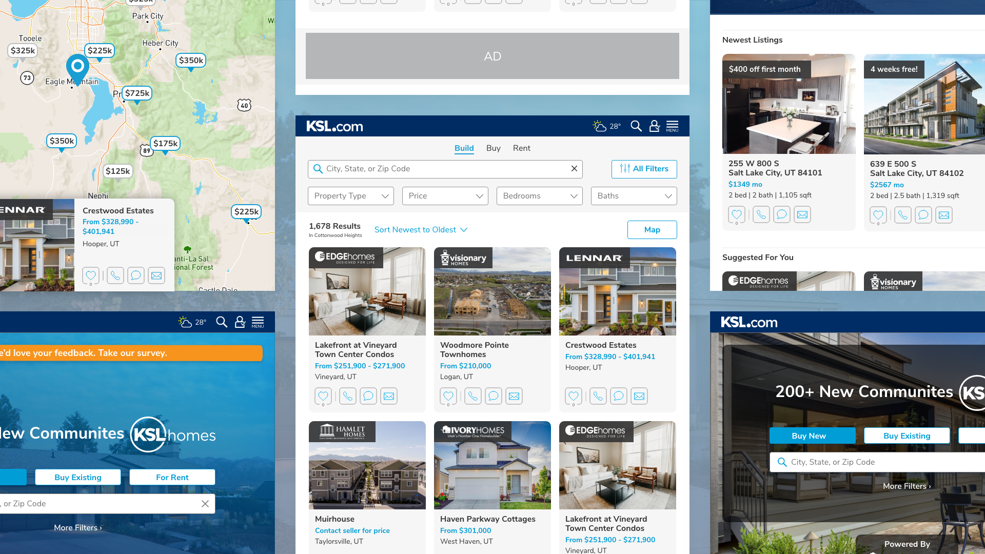
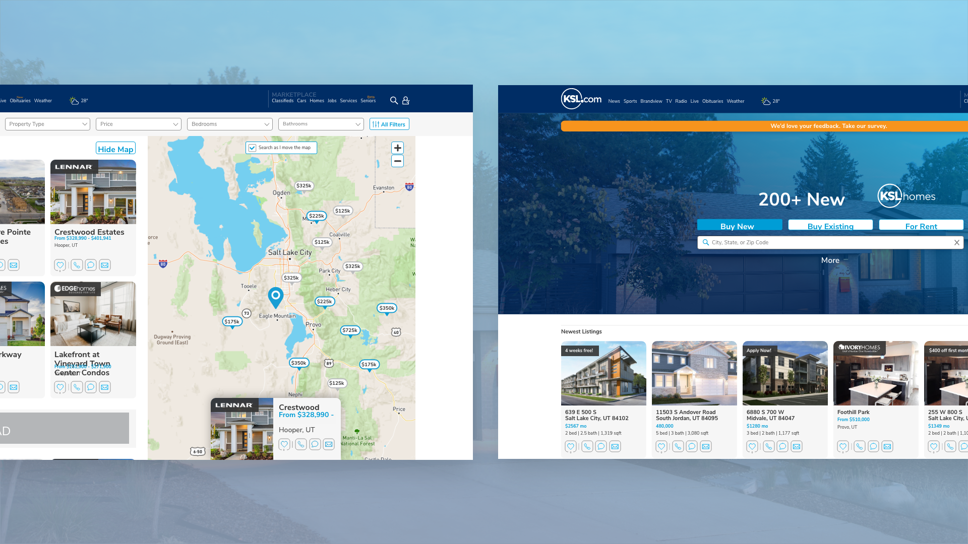
KSL Homes Homepage
OVERVIEW
KSL Homes provide users with 3 products. The first is Build, a product for users to see the majority of home builders and communities in Utah. The second is Buy, a product for users to browse both MLS listings and FSBO (For Sale by Owner) Listings. And finally, Rent, which provides users a location to see rental properties all across Utah.
The Challenge
The Users
Users come to KSL Homes to use a specific product, and currently don’t have a clear path to get to where they need. They have concerns about how the Search Results Page (SRP_ functions, and the lack of content on how to better educate themselves in both the real estate and rental sectors.
The Business
The business would like a larger inventory of products that they can sell to their clients, who have expressed an interest in sponsoring a section of KSL Homes. There are also concerns with SEO and gaining more organic searches to our site. Having recently gone through a sitewide rebrand, KSL would like to implement their new design system. This will make it easier to make changes site-wide changes in the future.
The Solution
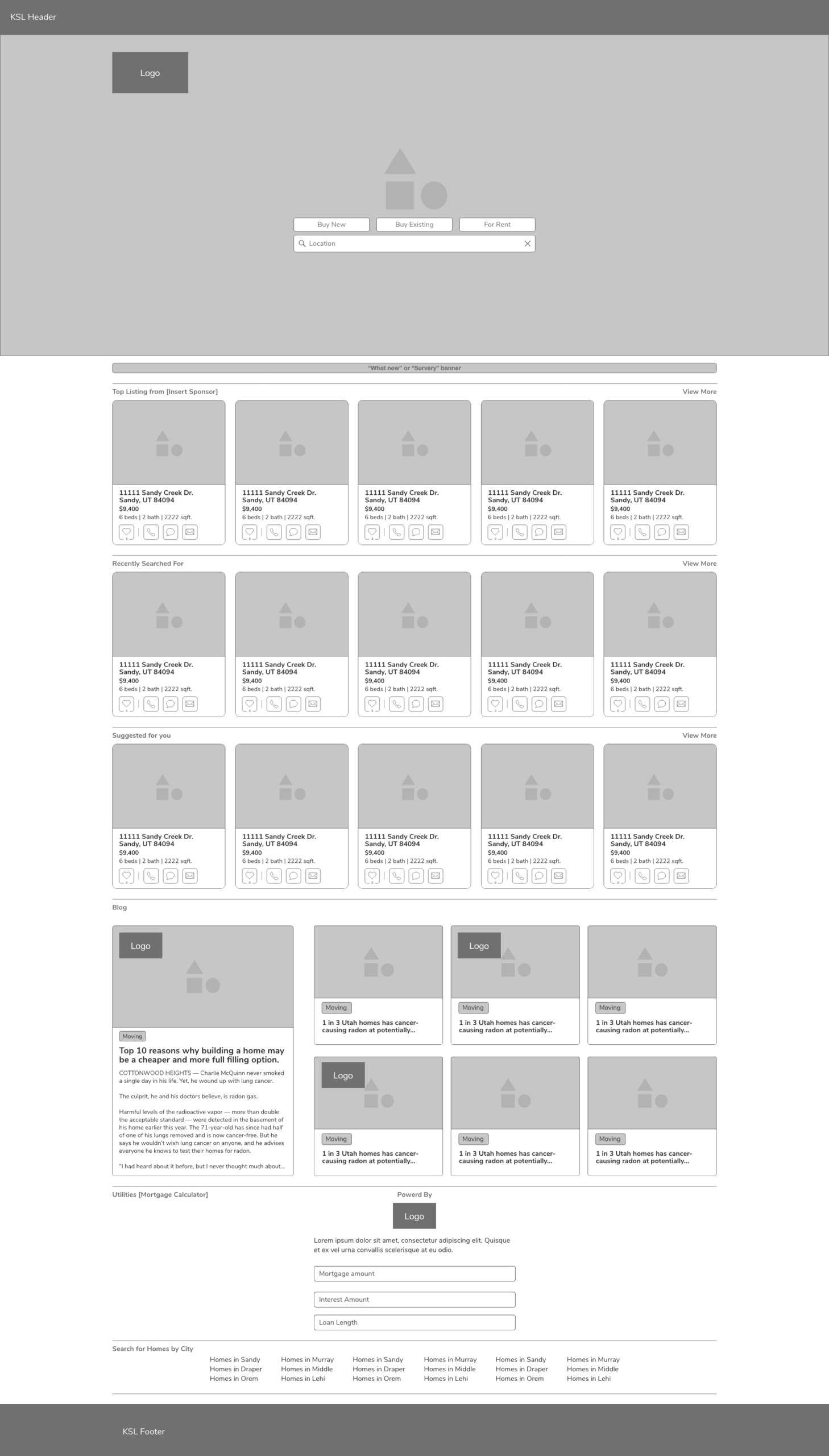
Home Page
By creating a new home page, users will be able to choose which product they are interested in. On this homepage, we could provide users with related listings to searches they have made in the past, as well as a quick way to access the KSL Homes Blog. This new page would have room for expansion for new features like saved searches and a mortgage calculator.
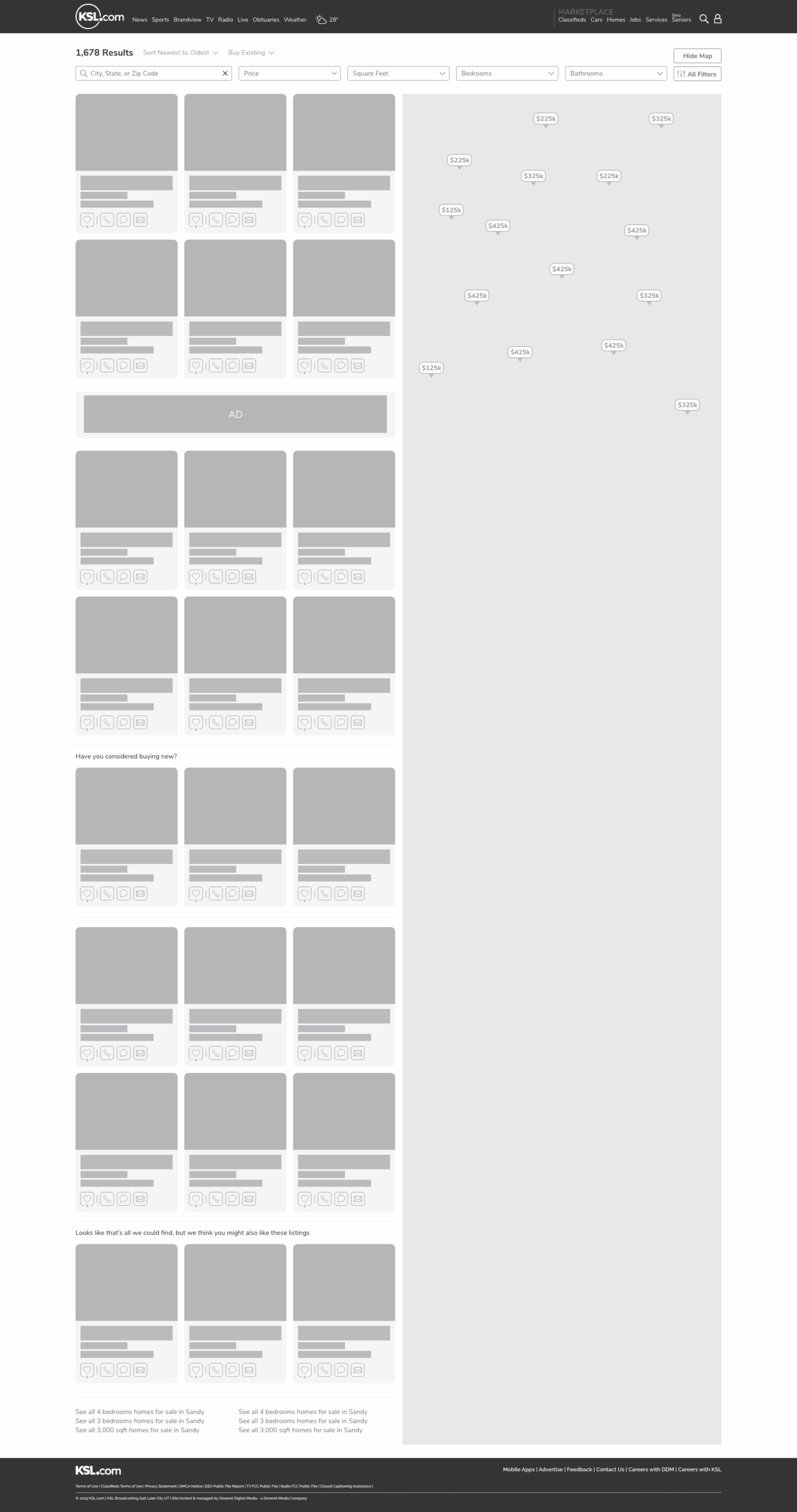
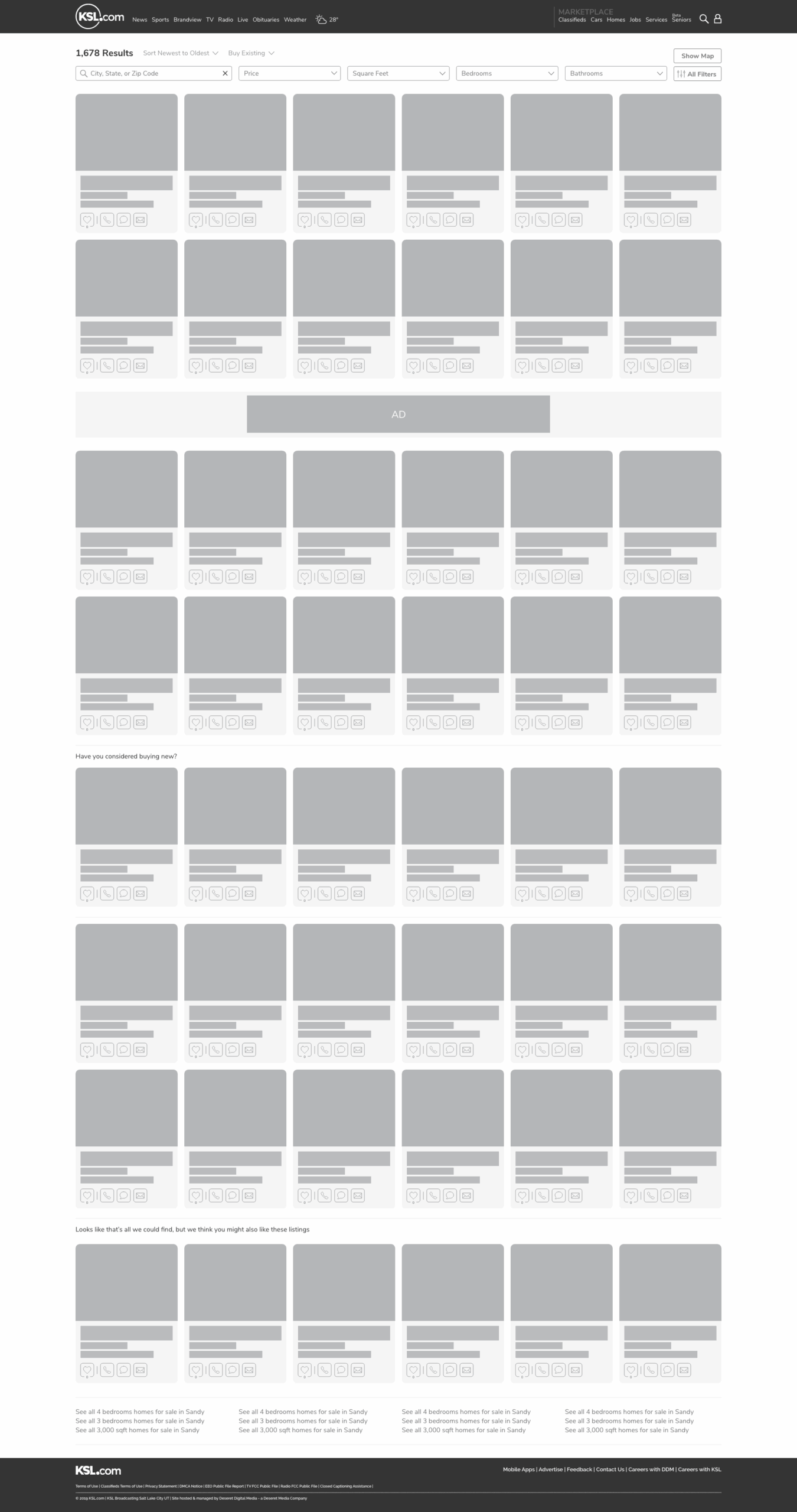
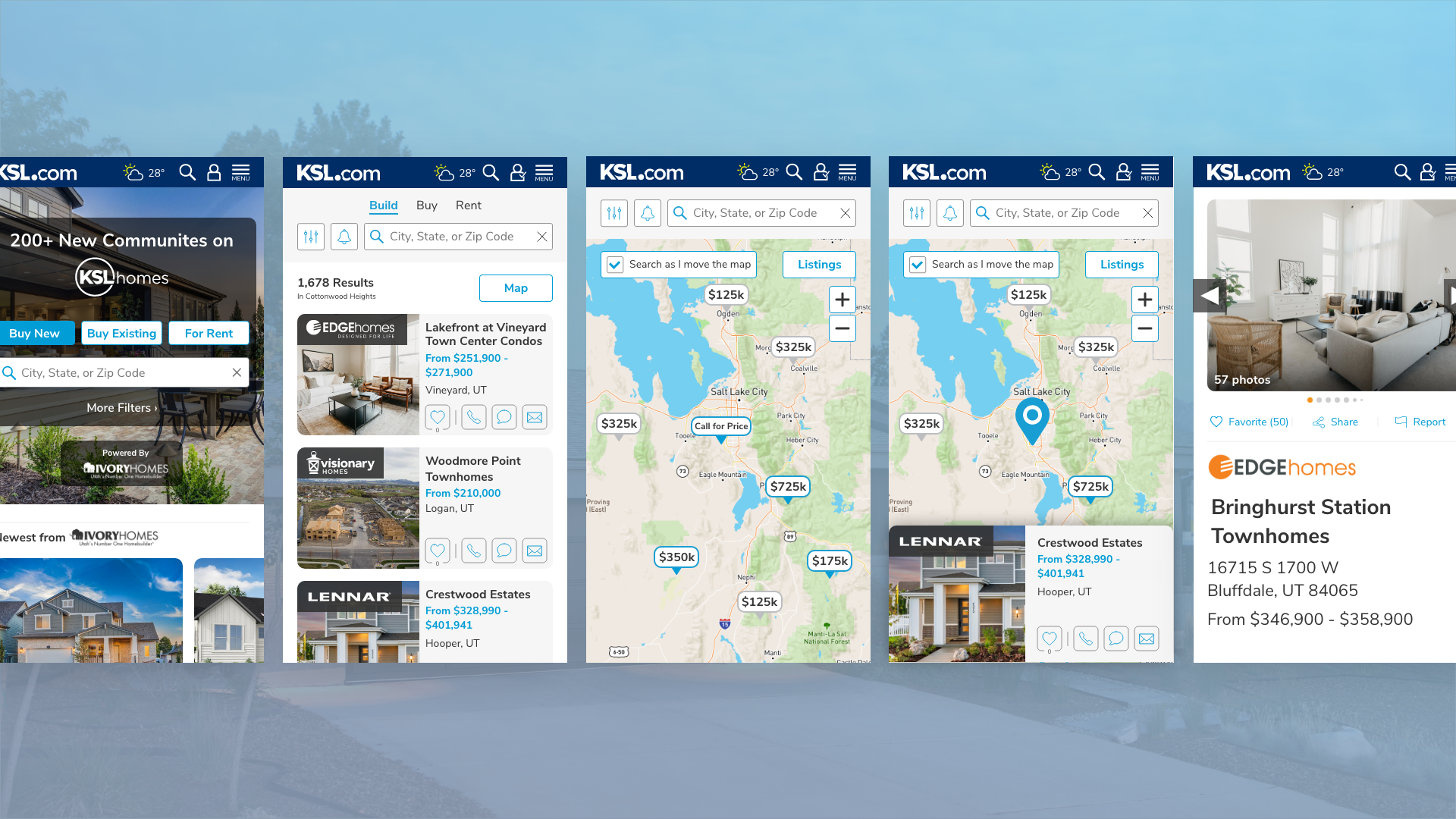
New SRP & Detail Pages
The next part of this solution would involve rebuilding the SRP and Detail page to address the concerns and pain points of our users. Including, larger images on the SRP, being able to expand and close the map, ease access to listing information, and more ways to reach out to builders, realtors, and rental properties.
DISCOVERY
We began this project by identifying the pain points the users had, and what new features they would like to see. First, we wrote a survey that established demographics, which products they use, their positive and negative opinion about the products, and what new features were most important to them. We emailed this out to a group of 500 users that had access to the SRP in the last 90 days. We also partnered with marketing and pushed the survey out over Facebook with an offer to be entered into a drawing for an Amazon gift card. Below are the results of that survey, the pain points we identified, and what features were most important.
While we were waiting for the results, we sent out an internal survey and interviewed key departments inside the organization to make sure we had correctly identified their concerns and pain points. We did the first interview with Senior Leadership, to cover the above as well as extract the historical context of the product. Finally, we interviewed Marketing, Sales, and CX to make sure that their concerns and feature needs were addressed and correctly articulated.
Pain Points

“When I go to KSL Homes it takes me to a list of builders, but what I’m looking for is a place to rent.”

“The listing images are very small, and I don’t always need the map. It really gets in the way sometimes, unless I’m looking for a specific area.”

“A lot of locations I search don’t show up in the results. Why can’t I search by neighborhood or county?”

“I get really frustrated with how the pins group together, I have to click multiple times to get down the listing I’m interested in.”

“Why can’t the pins have the price on them? Other sites have this feature”.

“It would be nice to be able to save what I’m looking at, and be notified later of any listings that match what I’m looking for.”
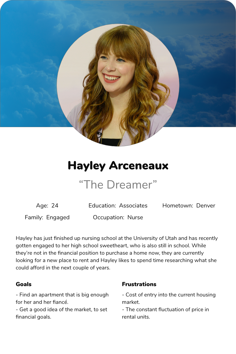
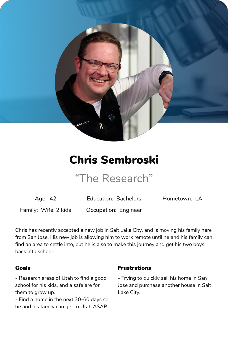
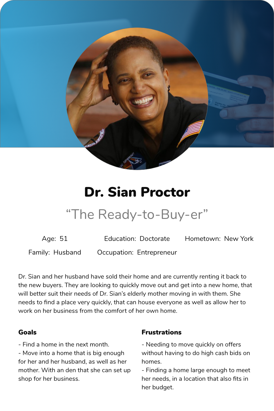
The Users
For this project, we broke the users down into three groups that reflected the sales funnel of all three products. The Dreamer, The Researcher, and The Ready-to-Buy-ers. While all of these are fairly self-explanatory, we wanted to make sure that each of these users’ needs is being met along the process of solving these problems.
SCOPE
Once we identified the shared pain points of the users and our business, we sat as a development team and went over all the solutions. We agreed upon a feature list and discussed some of the complexity of each of the solutions. From this, we set what our MVP would be, and what solutions could wait until after initial launch.
Home Page
The home page needs to have the following elements to be considered an MVP. The first is a solution for users to disseminate down into the three products: Build, Buy, and Rent. Next, there should be areas for users to see suggested listings based on what they have favorited in the past. Additionally, the page needs to have a way to navigate to the blog. And finally, it needs to have sales-related products that they can present to clients as sponsorships.
Search Results Page
The SRP needs to have the following to be considered an MVP. First, being a dynamic search for location that allows users to search by city, neighborhood, county, and other unique area identifiers in Utah. It needs to have larger images than what is currently on the site, as well as have a way to collapse the map. When the map is open, users would like to see the price on the map pins, as well as reduce the number of times they need to click to break up the grouping “bubbles”. And finally, users would like a way to save what they are currently searching for, to be notified of future listings that meet that criteria.
Detail Pages
For the MVP of the detail page we wanted to better organize the content, have the CTA’s have better contrast from the other content, as well as update our photo-viewer, and match the styles to the new design system.
SOLUTION
In order to keep everyone on the same page and feel like they were a part of the final solution, we found it imperative that all brainstorming sessions be done with the development team. We didn’t want to present an overly complex solution to developers or present a redressed solution to stakeholders than what was already proposed. We spent several sessions going over each solution both in the user flow and wireframe stage to make sure everyone was comfortable with what we pitched to stakeholders. Once these were complete and we moved into High Fidelity designs, we then did user interviews comparing the two SRP’s. We also got their opinion on the new home page. This was very helpful as we were able to gauge the user’s reaction to these changes and gain insight into possible future pain points.
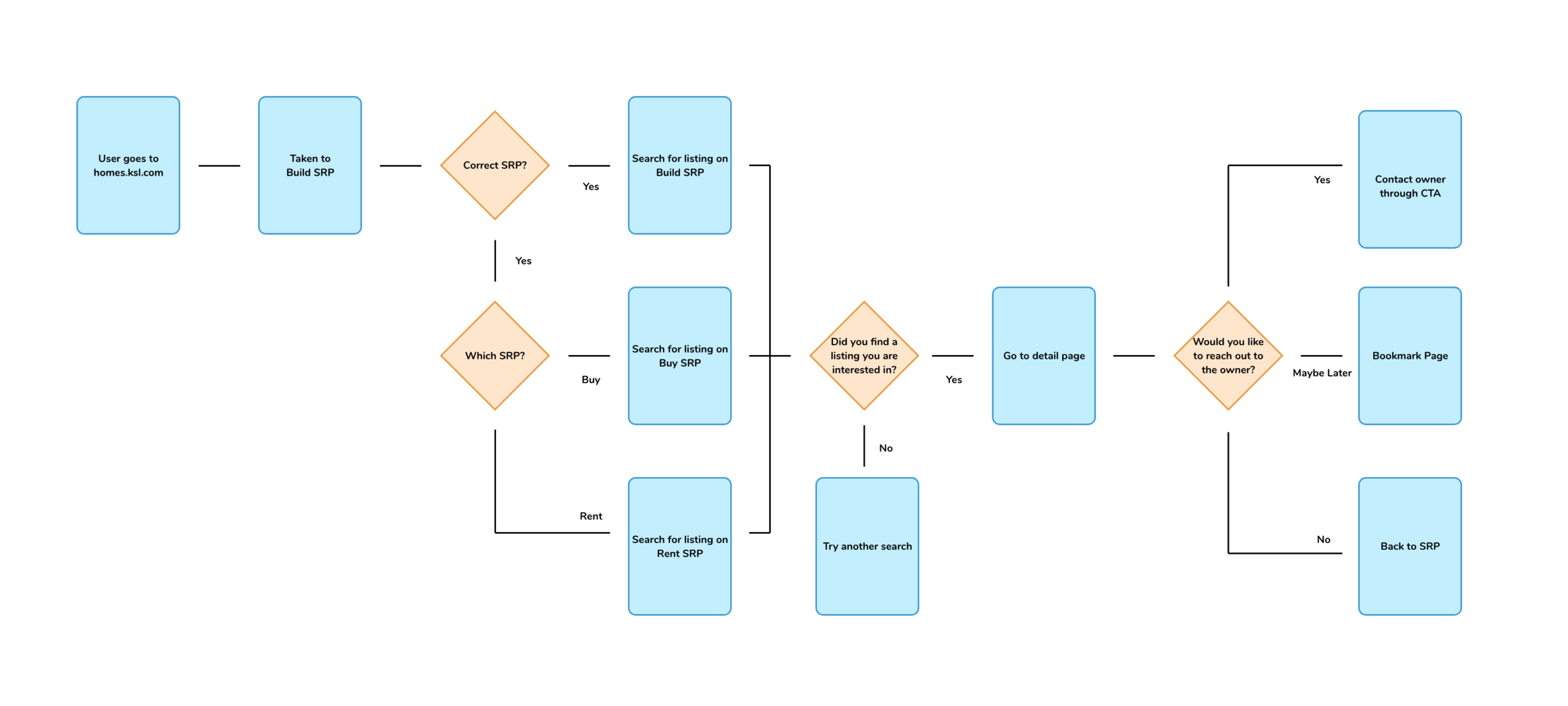
User flow before
The user flow on the left clearly illustrates the users pain points, and how they would get stuck on one of the products.
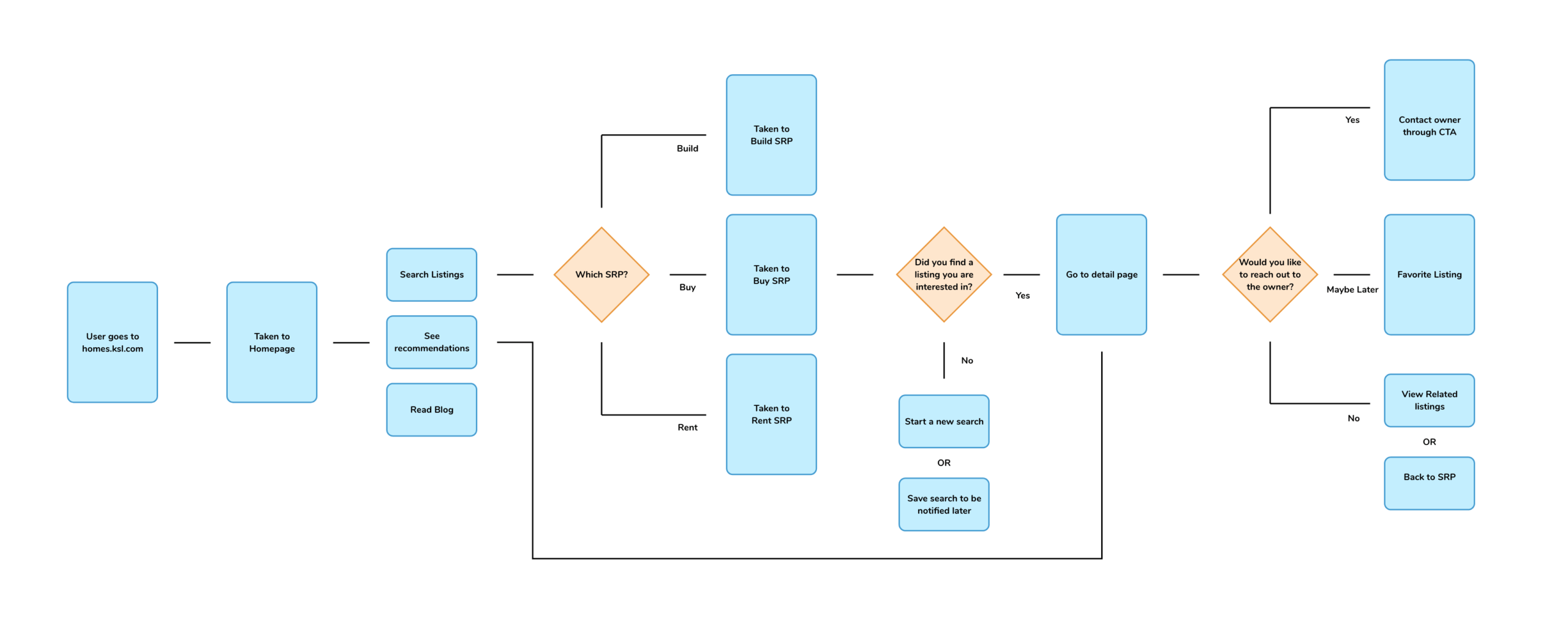
User flow after
This user flow on the left is much easier to follow, and allows for clear decisions on what product users would like to use.
Wireframes
High Fidelity
SO... NOW WHAT?
What we learned
During the length of this process, the two biggest takeaways we had were patience and acceptance. About halfway into this process, our company experience was is now known as “The Great Resignation”. We lost a lot of our developers and one of our project managers during this time. It was incredibly difficult to replace these positions and at times it felt like we came to a grinding halt. We learned a lot of patience from having to deal with the pace at which the team was working, as well as acceptance on how thin our MVP will be at launch. Both of which ended up being great in the end, and we would eventually get the features for the product built at a later date.
What we're doing next
Our next steps for the product are pretty simple- watch and listen. We’re going to watch the performance of the products and keep a record of improvements to key performance indicators (KPI). Our biggest KPI’s are: engagements on detail pages and SRP, and the number of lead’s to our clients. We are going to send out surveys to both users and clients, and pending those results build interviews to engage with those users. From that point, we will start the process by identifying pain points.
Photos by Chad Hurst at www.chadhurst.com

ReKindle App
OVERVIEW
ReKindle is an app geared towards bringing couples closer together by having them learn about and communicate through each others love languages. Whether you’ve just gotten married or have been together for decades, ReKindle can help bring you closer to your partner. By using a series of assessments, ReKindle can identify each partner’s love languages and use a series of “Sparks” to help you communicate to your partner in the way they desire.
The Challenge
The owners built the original idea and had done a substantial amount of market and user research for the product. They just needed someone to take their ideas and put them down on paper so that they could hand it off to a development team to get it built. This is where I came in. I was introduced to the duo through some friends and immediately hit the ground running. Turning their stack of paper that was hiding a masterpiece, into a visually engaging product that users could use daily.
The Solution
I first started by reading through all of the research that they had already conducted. They had a lot of great content which made it easy on my behalf to break this product down into user groups. I then was able to take those two user personas and build a complex user flow, guiding the user through several minimal assessments that users could take at their leisure. They were rewarded for completing these assessments and unlocking new features of the app, and getting more insight into their partner’s love language. After that, I worked on some wireframes with the clients and built some high-fidelity mock-ups. Once we had a packaged file we could send to the development team, I then worked with them to come up with some branding and identity ideas for their app.
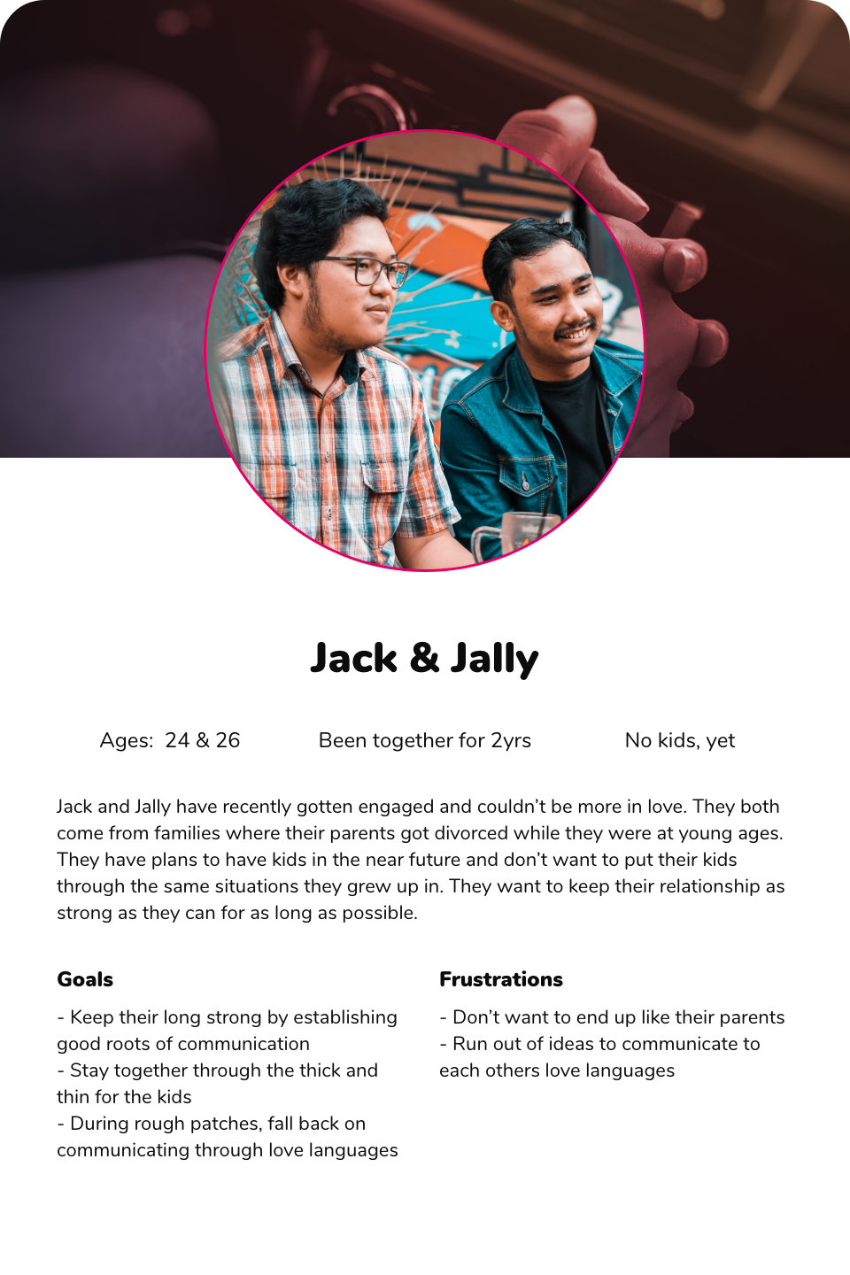
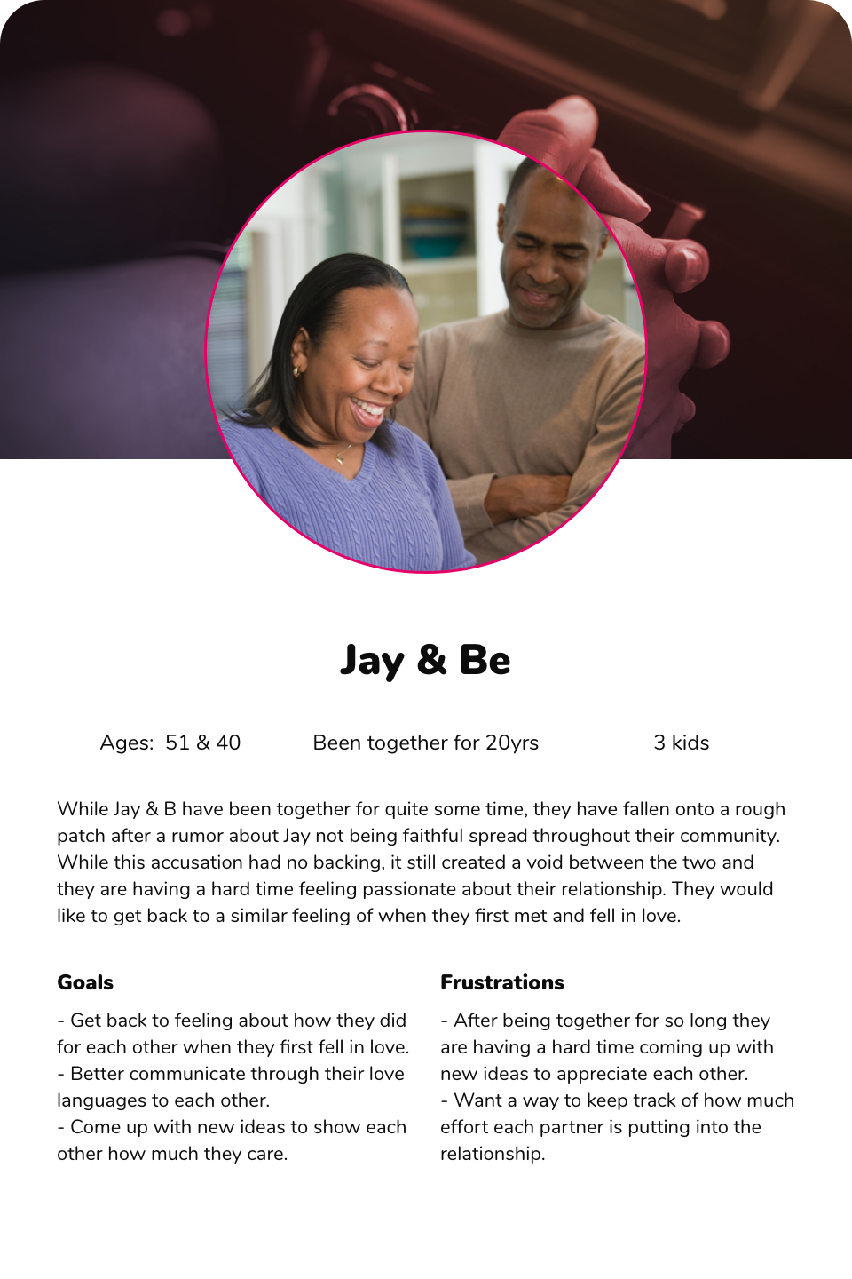
THE USERS
With the research the clients had already done, I was able to build out two user personas. The first is a couple that had recently had a change in their relationship, whether they just got together, or got married after dating for several years. Their relationship is very solid, but they want to find new ways to show how much they care for their partner. The second persona is a couple that has been together for quite some time, they have fallen onto some rocky points and would like to rebuild that love they once felt for each other.
THE USER FLOWS
The user flows for ReKindle were some of the most complex I have ever built. There were multiple assessments that had to be created, where each one unlocked new features of the app. Once all the assessments had been completed, there was also a paid tier that unlocked even more features. This took quite a bit of communication between myself and the clients to make sure that every piece of this puzzle was in the user flow.
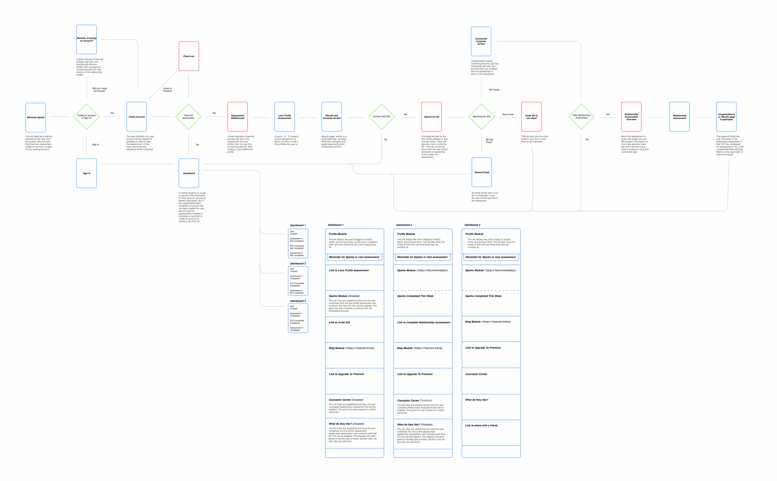
THE WIREFRAMES
Next came the wireframes. There was nothing out of the ordinary here other than the sheer volume that had to be complete. This was one of the first products I had built from the ground up, and I quickly realized there were going to be a lot of screens to build.
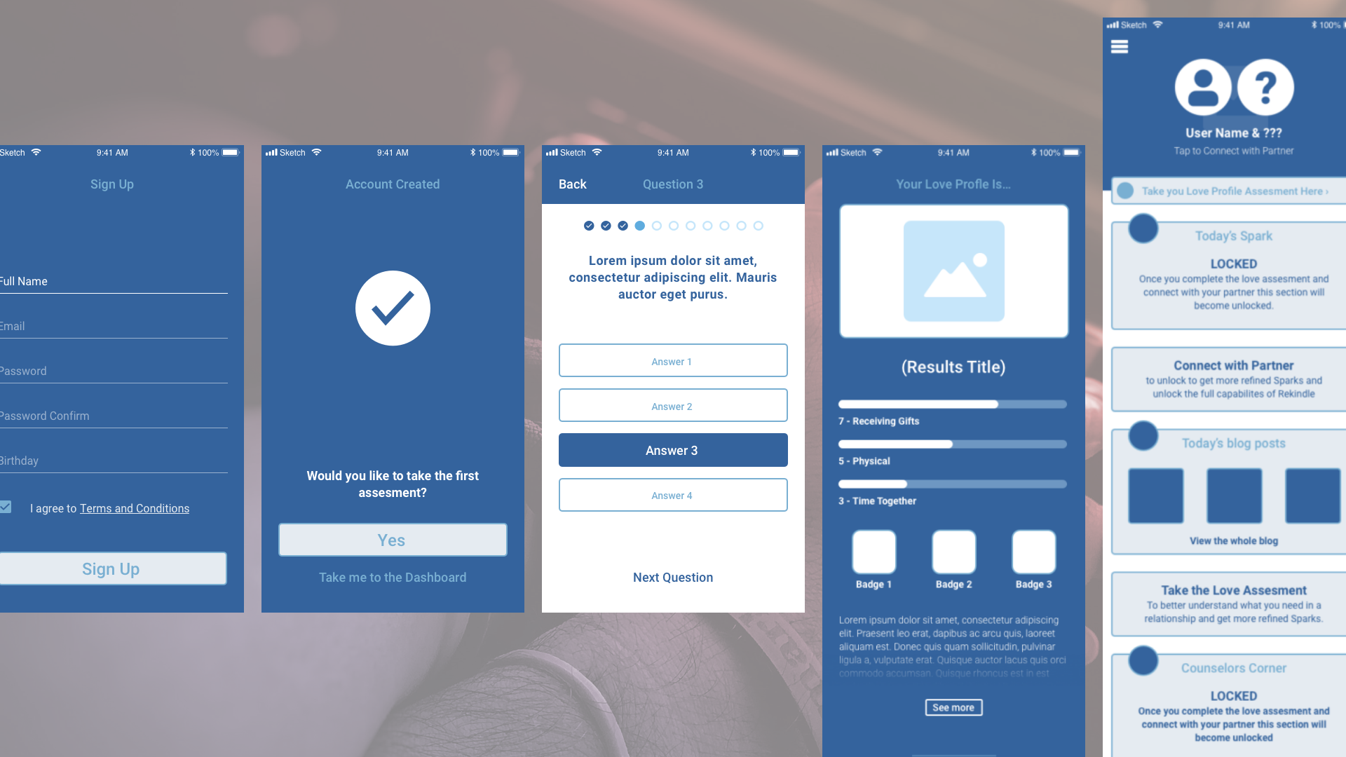
THE HIGH FIDELITY MOCKUPS
At this point in the project the client was very impressed with my attention for detail. While this is always a great thing to hear, they soon informed me that because of this they would like to see what each of the assessments looked like with the questions and answers in them. Not just with lorem ipsum. Which meant building out A LOT of pages for them. They were happy with the results, and we kept on plugging away.
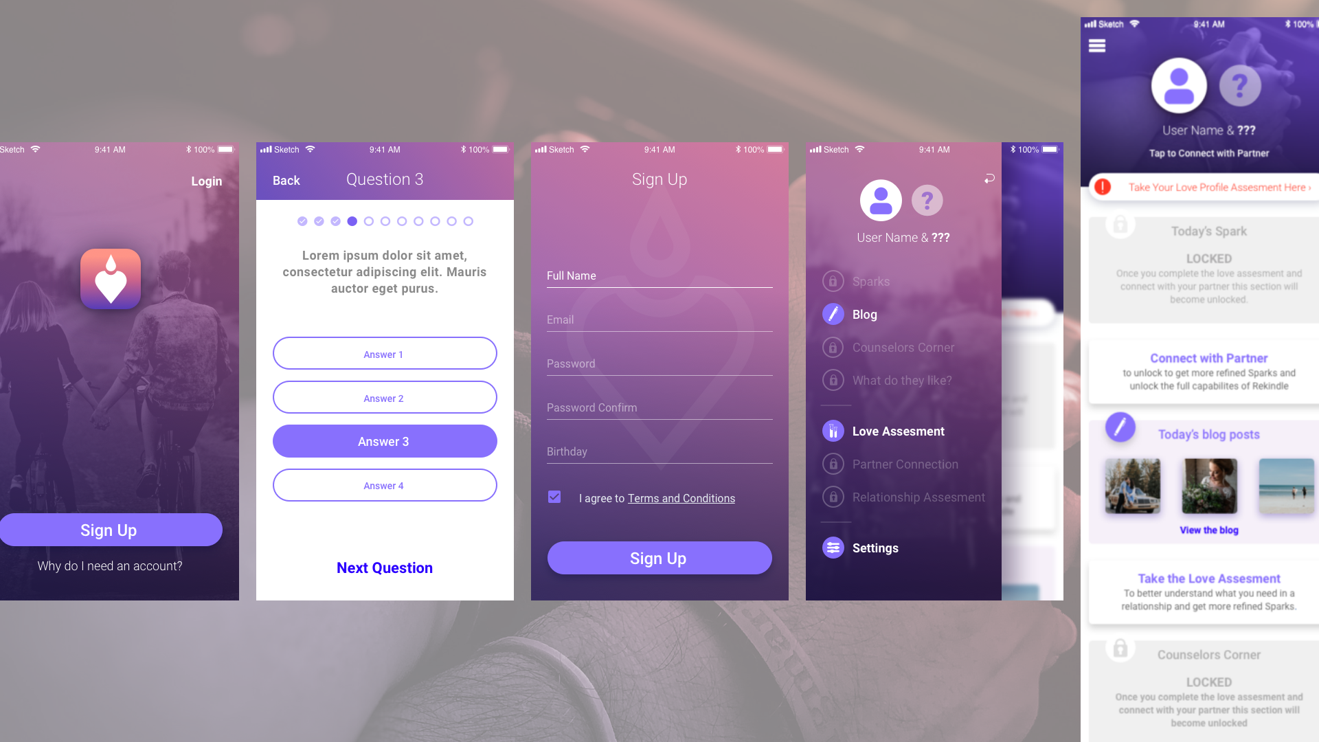
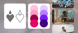
THE BRAND EXPLORATION
At this point, the owners of ReKindle were ecstatic with the progress we had made. They were blown out of the water, and they were falling in love again with the product they had worked so hard on. The original scope of the project was complete and I was able to sell them on the idea that they needed a baseline brand set in place. We built this while the development team worked on the files we had handed off. They loved the idea and I started work on pitching ideas to them for logos, colors, and imagery.
THIS APP SOUNDS AWESOME, WHERE CAN I GET IT?
Unfortunately, after we handed off the package to the developers and did some brand exploration, I stopped hearing from the clients. I would later find out that they were not able to secure the funding they needed to get the app built. I was heartbroken because I was emotionally invested in this project and wanted to see it succeed. I left the door open with the client and told them to let me know if the app ever got built.