OVERVIEW
KSL Homes provide users with 3 products. The first is Build, a product for users to see the majority of home builders and communities in Utah. The second is Buy, a product for users to browse both MLS listings and FSBO (For Sale by Owner) Listings. And finally, Rent, which provides users a location to see rental properties all across Utah.
The Challenge
The Users
Users come to KSL Homes to use a specific product, and currently don’t have a clear path to get to where they need. They have concerns about how the Search Results Page (SRP_ functions, and the lack of content on how to better educate themselves in both the real estate and rental sectors.
The Business
The business would like a larger inventory of products that they can sell to their clients, who have expressed an interest in sponsoring a section of KSL Homes. There are also concerns with SEO and gaining more organic searches to our site. Having recently gone through a sitewide rebrand, KSL would like to implement their new design system. This will make it easier to make changes site-wide changes in the future.
The Solution
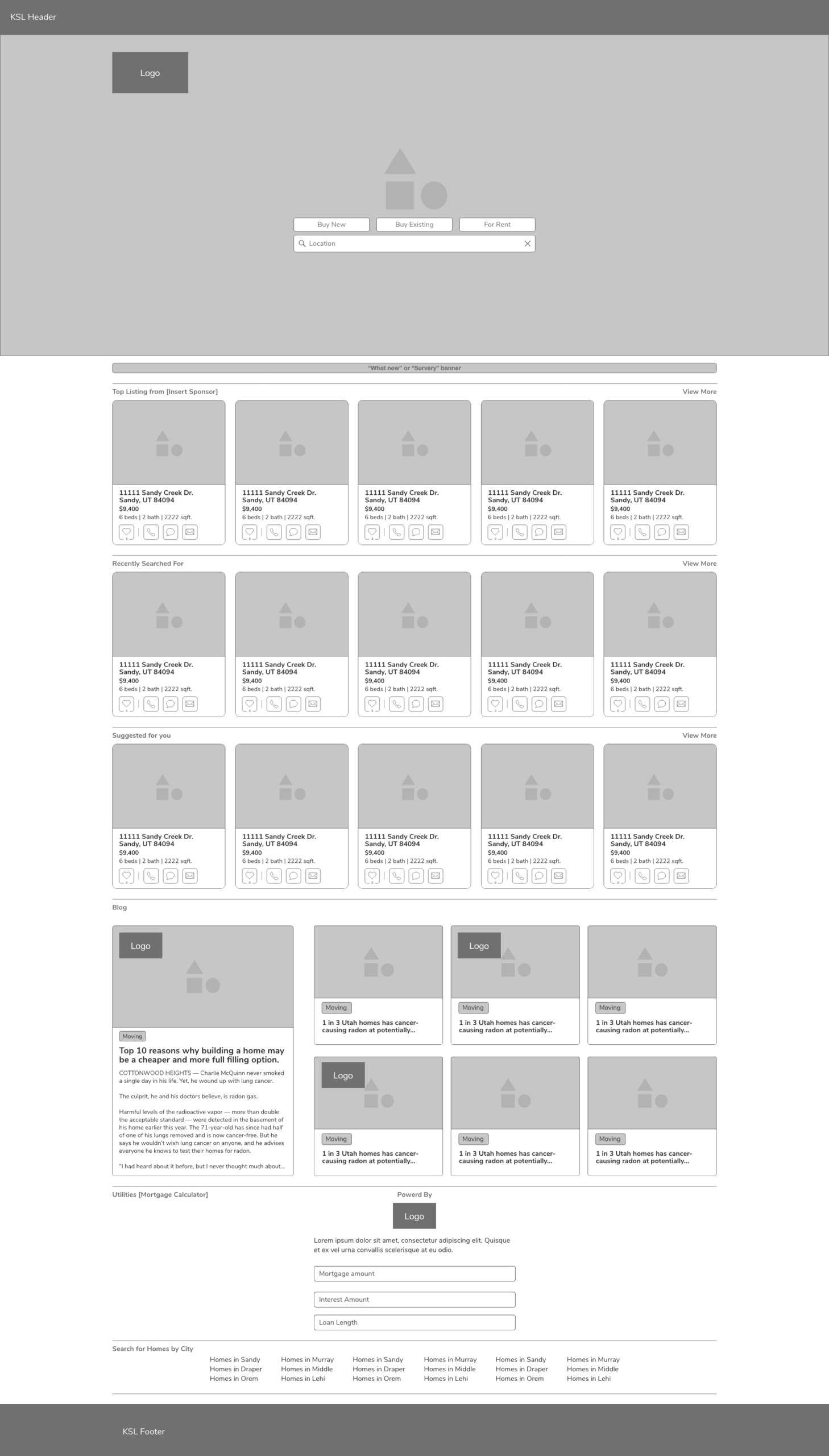
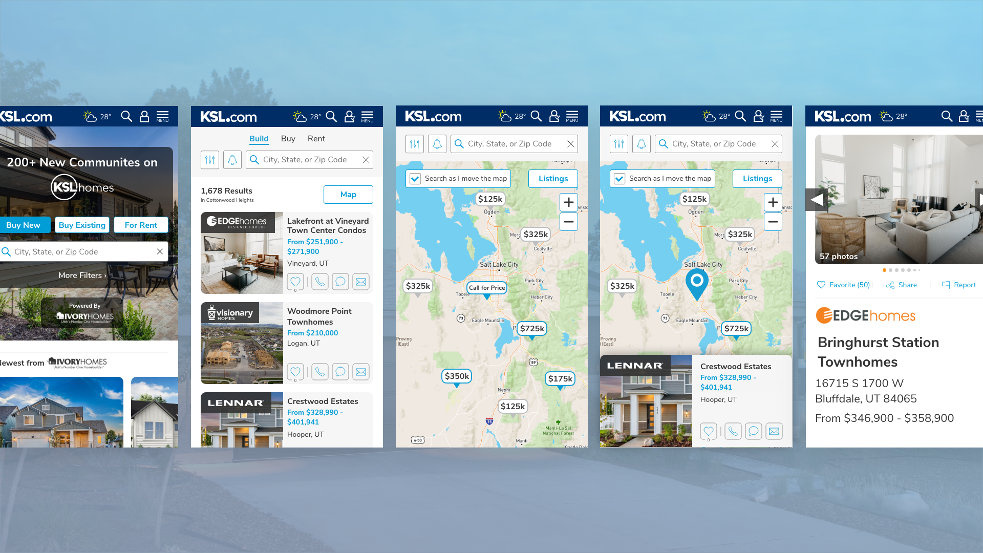
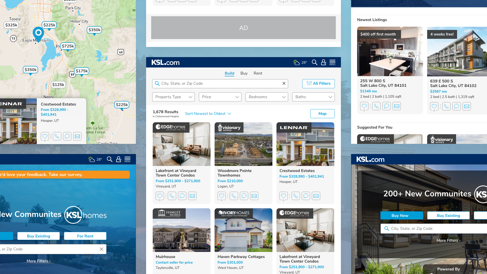
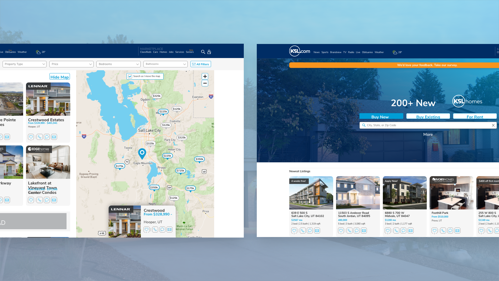
Home Page
By creating a new home page, users will be able to choose which product they are interested in. On this homepage, we could provide users with related listings to searches they have made in the past, as well as a quick way to access the KSL Homes Blog. This new page would have room for expansion for new features like saved searches and a mortgage calculator.
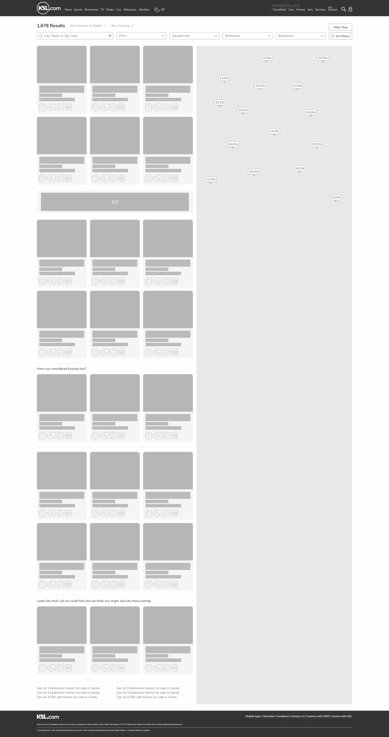
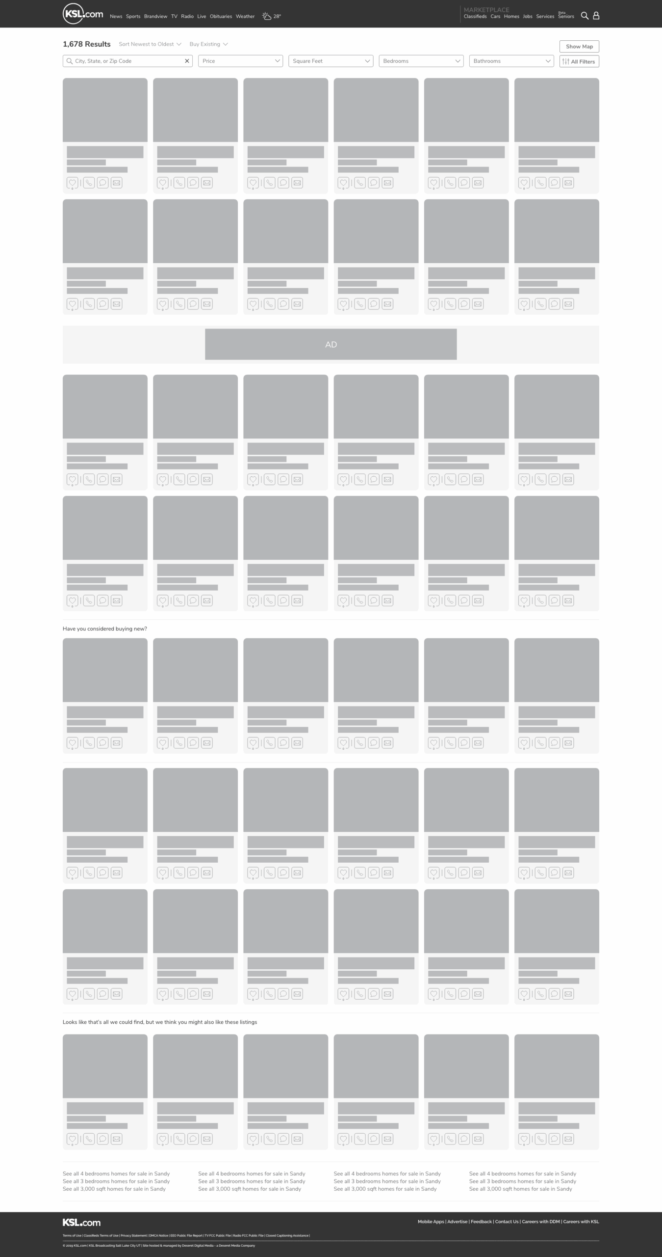
New SRP & Detail Pages
The next part of this solution would involve rebuilding the SRP and Detail page to address the concerns and pain points of our users. Including, larger images on the SRP, being able to expand and close the map, ease access to listing information, and more ways to reach out to builders, realtors, and rental properties.
DISCOVERY
We began this project by identifying the pain points the users had, and what new features they would like to see. First, we wrote a survey that established demographics, which products they use, their positive and negative opinion about the products, and what new features were most important to them. We emailed this out to a group of 500 users that had access to the SRP in the last 90 days. We also partnered with marketing and pushed the survey out over Facebook with an offer to be entered into a drawing for an Amazon gift card. Below are the results of that survey, the pain points we identified, and what features were most important.
While we were waiting for the results, we sent out an internal survey and interviewed key departments inside the organization to make sure we had correctly identified their concerns and pain points. We did the first interview with Senior Leadership, to cover the above as well as extract the historical context of the product. Finally, we interviewed Marketing, Sales, and CX to make sure that their concerns and feature needs were addressed and correctly articulated.
Pain Points

“When I go to KSL Homes it takes me to a list of builders, but what I’m looking for is a place to rent.”

“The listing images are very small, and I don’t always need the map. It really gets in the way sometimes, unless I’m looking for a specific area.”

“A lot of locations I search don’t show up in the results. Why can’t I search by neighborhood or county?”

“I get really frustrated with how the pins group together, I have to click multiple times to get down the listing I’m interested in.”

“Why can’t the pins have the price on them? Other sites have this feature”.

“It would be nice to be able to save what I’m looking at, and be notified later of any listings that match what I’m looking for.”
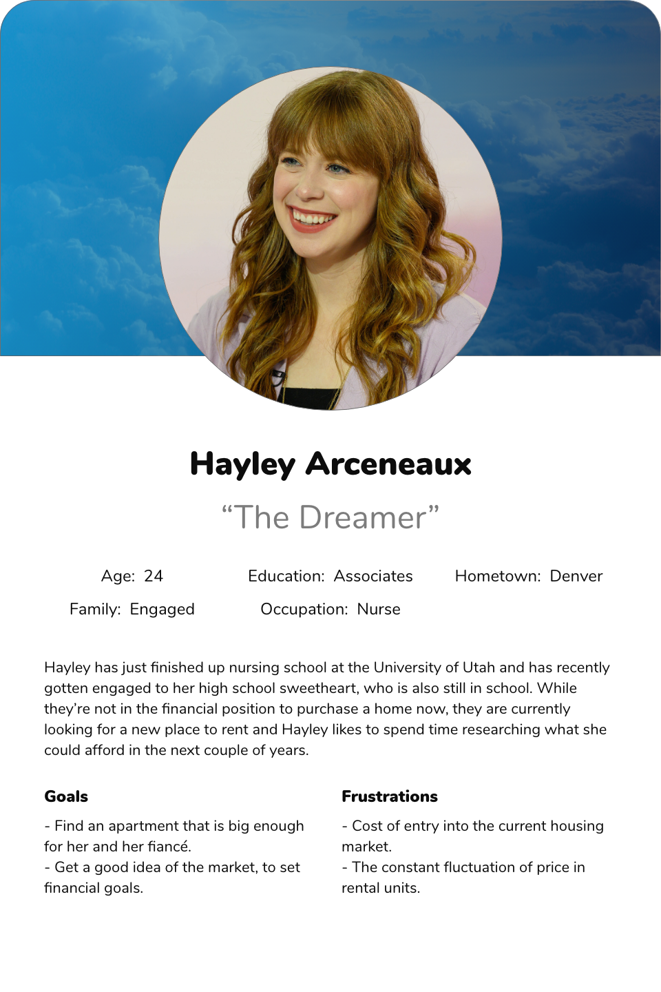
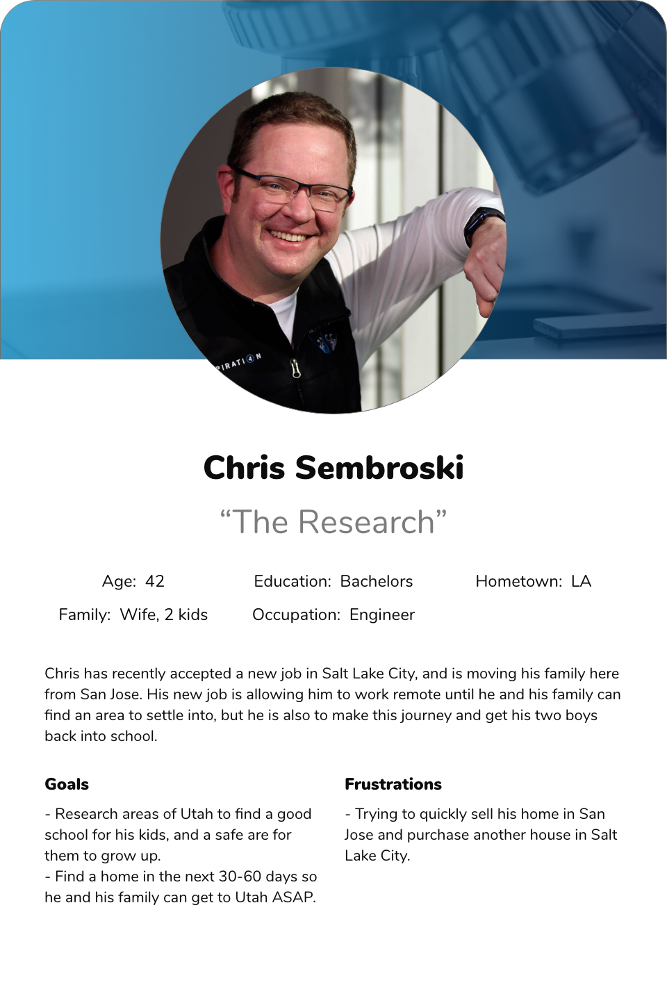
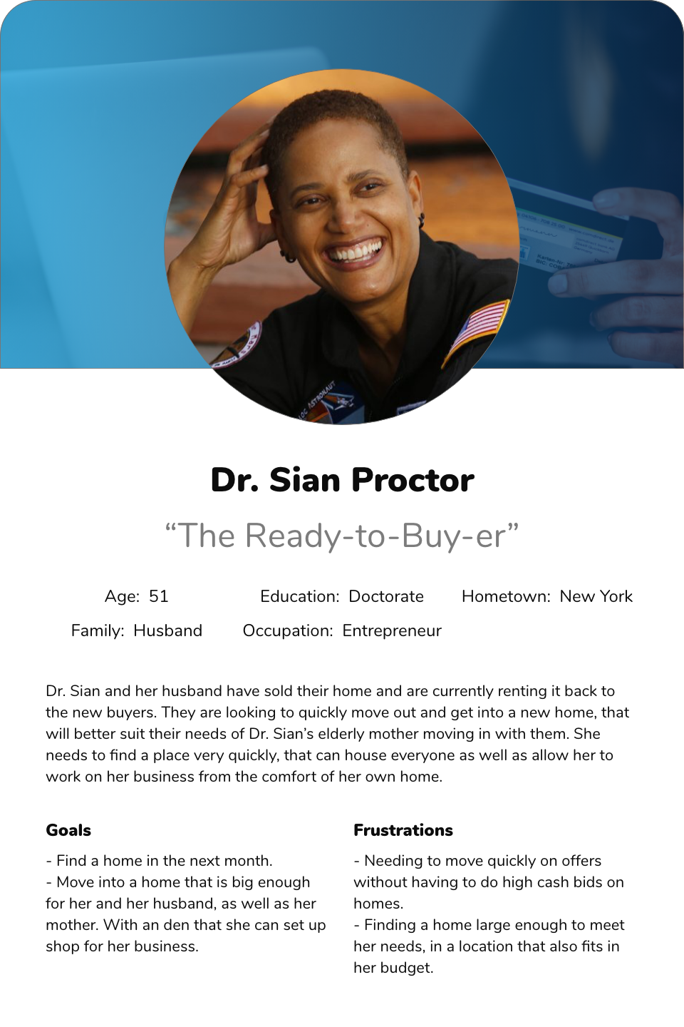
The Users
For this project, we broke the users down into three groups that reflected the sales funnel of all three products. The Dreamer, The Researcher, and The Ready-to-Buy-ers. While all of these are fairly self-explanatory, we wanted to make sure that each of these users’ needs is being met along the process of solving these problems.
SCOPE
Once we identified the shared pain points of the users and our business, we sat as a development team and went over all the solutions. We agreed upon a feature list and discussed some of the complexity of each of the solutions. From this, we set what our MVP would be, and what solutions could wait until after initial launch.
Home Page
The home page needs to have the following elements to be considered an MVP. The first is a solution for users to disseminate down into the three products: Build, Buy, and Rent. Next, there should be areas for users to see suggested listings based on what they have favorited in the past. Additionally, the page needs to have a way to navigate to the blog. And finally, it needs to have sales-related products that they can present to clients as sponsorships.
Search Results Page
The SRP needs to have the following to be considered an MVP. First, being a dynamic search for location that allows users to search by city, neighborhood, county, and other unique area identifiers in Utah. It needs to have larger images than what is currently on the site, as well as have a way to collapse the map. When the map is open, users would like to see the price on the map pins, as well as reduce the number of times they need to click to break up the grouping “bubbles”. And finally, users would like a way to save what they are currently searching for, to be notified of future listings that meet that criteria.
Detail Pages
For the MVP of the detail page we wanted to better organize the content, have the CTA’s have better contrast from the other content, as well as update our photo-viewer, and match the styles to the new design system.
SOLUTION
In order to keep everyone on the same page and feel like they were a part of the final solution, we found it imperative that all brainstorming sessions be done with the development team. We didn’t want to present an overly complex solution to developers or present a redressed solution to stakeholders than what was already proposed. We spent several sessions going over each solution both in the user flow and wireframe stage to make sure everyone was comfortable with what we pitched to stakeholders. Once these were complete and we moved into High Fidelity designs, we then did user interviews comparing the two SRP’s. We also got their opinion on the new home page. This was very helpful as we were able to gauge the user’s reaction to these changes and gain insight into possible future pain points.
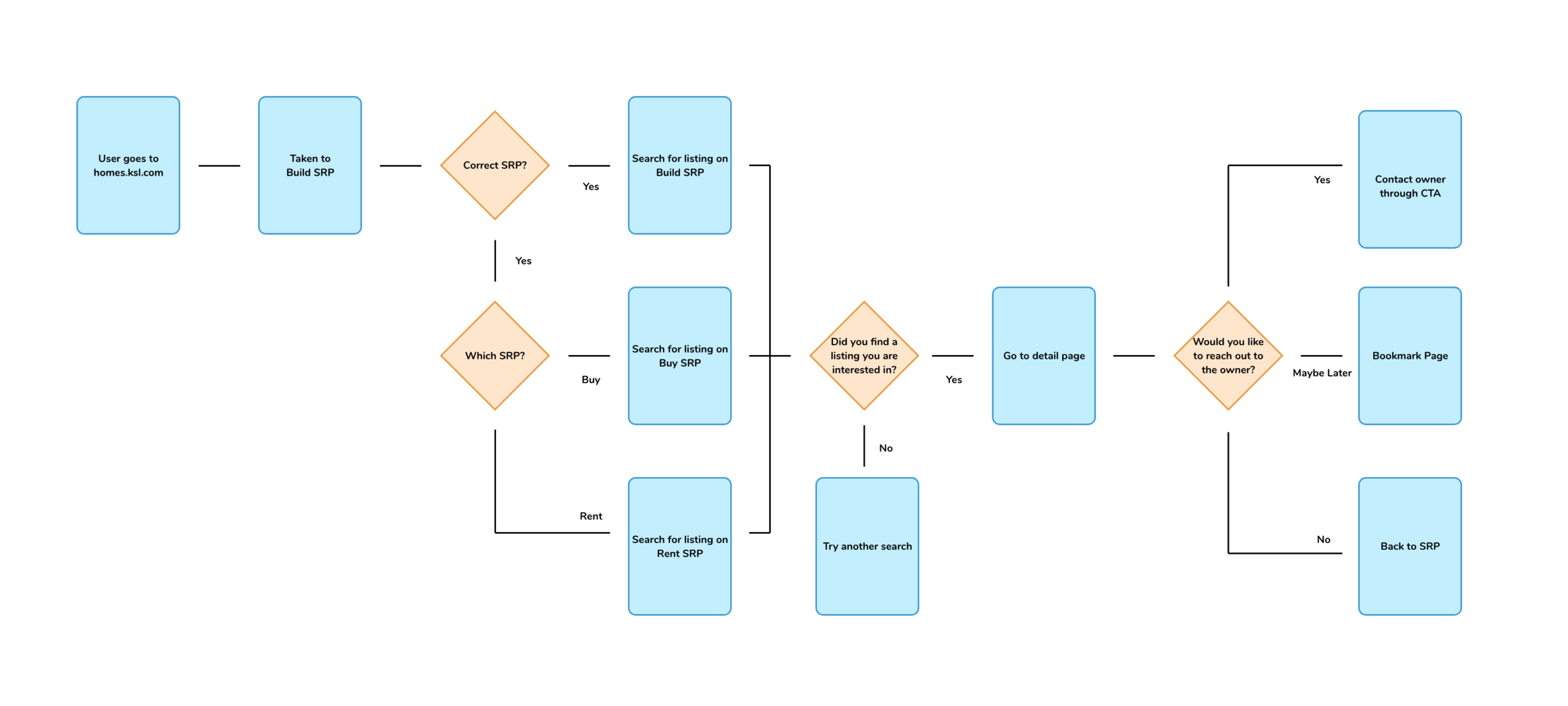
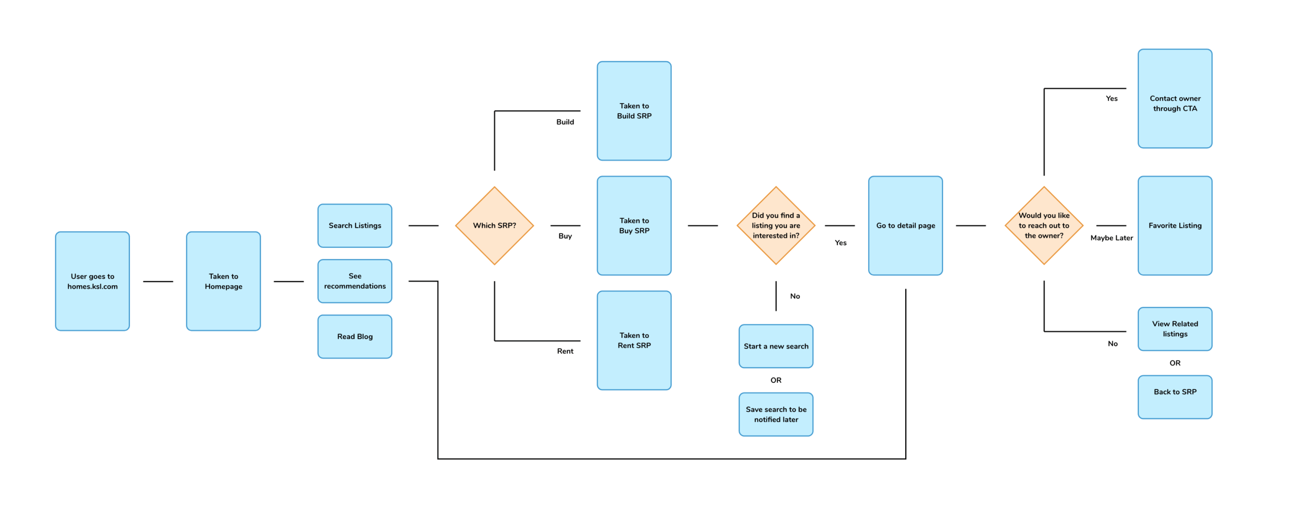
User flow before
The user flow on the left clearly illustrates the users pain points, and how they would get stuck on one of the products.
User flow after
This user flow on the left is much easier to follow, and allows for clear decisions on what product users would like to use.
Wireframes
High Fidelity
SO... NOW WHAT?
What we learned
During the length of this process, the two biggest takeaways we had were patience and acceptance. About halfway into this process, our company experience was is now known as “The Great Resignation”. We lost a lot of our developers and one of our project managers during this time. It was incredibly difficult to replace these positions and at times it felt like we came to a grinding halt. We learned a lot of patience from having to deal with the pace at which the team was working, as well as acceptance on how thin our MVP will be at launch. Both of which ended up being great in the end, and we would eventually get the features for the product built at a later date.
What we're doing next
Our next steps for the product are pretty simple- watch and listen. We’re going to watch the performance of the products and keep a record of improvements to key performance indicators (KPI). Our biggest KPI’s are: engagements on detail pages and SRP, and the number of lead’s to our clients. We are going to send out surveys to both users and clients, and pending those results build interviews to engage with those users. From that point, we will start the process by identifying pain points.
Photos by Chad Hurst at www.chadhurst.com